Smartphones have revolutionized the way we communicate with each other. We reach for our phones almost by instinct when we are bored, and this convenience is precisely what makes it different from a desktop computer. Businesses are growing used to the idea of creating web content primarily for mobile users – especially so when mobile users make up a majority of internet traffic.
Surveys reveal that an overwhelming number of users would leave a website if they cannot access content properly. The increased user traffic and customer retention would then hinge on presenting the information they seek on a readable and well-designed web page. Read on to find out more about mobile-friendly websites and how you can increase user traffic with better designs.
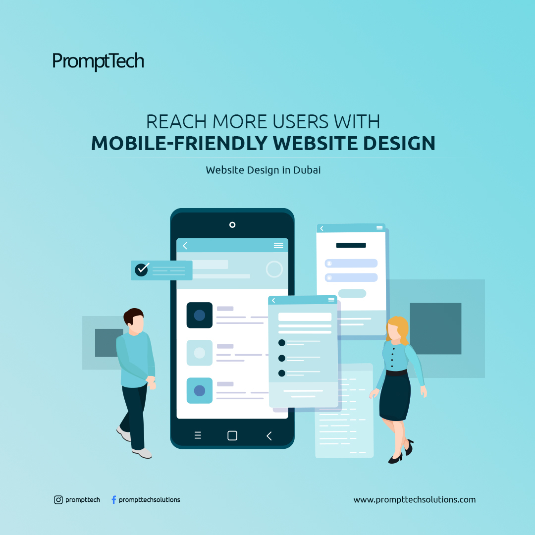
What’s a Mobile-friendly Website?
This simply means that the website content is designed for use on mobile devices as well as websites. The content – text, media, links – adapts to the smaller screen on a mobile device and is readable to the mobile phone user. At a deeper level, this involves a lot of resizing and coding to make full use of the mobile platform and deliver the content with a unique user experience.
The big push for mobile-friendly web design stems from the fact that Google switched to mobile-first indexing recently. This means that Google would rank websites based on the mobile version of its content first, instead of the desktop version as it had been earlier. This implies companies must produce better quality mobile web content to stay ahead in the game. Let us look at some of the ways to make this possible for a more effective user engagement.
Faster Loading
The average website loads in approximately 15 seconds. But about half of online users expect a loading time of fewer than 4 seconds before they hit the ‘back’ button and move on to another website. Large media files can slow down websites considerably – and mobile devices may not support high-resolution media from loading properly. Optimize your website for fast loading so users stay on longer.
Well-spaced Buttons
Buttons initiate actions on a web page – Log in, Submit, Cancel. They are different from hyperlinks that redirect users to other pages either on the same website or an external website. On a desktop, users can click on the buttons with their mouse, so having buttons placed close to one another may not be a functional issue (it could still be visually monotonous).
On a mobile device, however, users tap on the screen with their fingers. So the buttons must be large enough to be clicked without zooming in and be spaced well-apart to prevent users from accidentally clicking on the wrong buttons. A UI UX Designer in Dubai would be able to help design an effective button layout for a better user experience.
Readable Text Content
This is probably the most obvious part of web design in general. The amount of text content on a web page may vary, but users should be able to read it all just the same. Well-spaced text content that fits the mobile screen allows users to read more comfortably. Users should not have to zoom in or scroll from side to side to read the text. This also goes for the choice of font – you could have a visually appealing font but if the user is unable to read it properly, you stand to lose their attention.
Accessible Menus
Managing menu content on a desktop screen is pretty straightforward. There is a lot of space for laying out the menu options so that users do not have to click a lot to access information. This also gives a lot of room for experimenting with different menu layouts – sidebar menus and expand-on-hover menus for a better user experience.
Mobile screens lack the space required for packing extensive menu options. Most websites use the hamburger symbol – 2-3 horizontal lines stacked on top of each other – to represent the menu button. This would provide a basic overview, and allow users to search for more detailed content within the website directly.
Always on Call
Users might be looking to get in touch with you for a product or service or raise an issue with you. Customer service is a top priority for many customers when making a purchase, providing support any time is guaranteed to bring in more customers.
Providing a ‘Contact Us’ form initiates engagement and allows users to provide feedback at any time. This should be continually reviewed to ensure that user responses actually reach you via the form. Many websites also have a live chat option for users to interact with a representative. If that sounds like too much, you can always get a UI UX Designer in Dubai to link it to a chatbot that does the same function.
Simple Forms
Website forms collect information from users. On a desktop, users would be more open to long forms that require a lot of typing. But on mobile devices, users would be more inclined to simpler forms with accessible buttons and fields that require less input. Including drop-down menus as part of forms can help users enter information more easily.
Call-to-Action
An eye-catching call to action prompts users to take some action. This marketing tactic spurs user engagement using a banner or text content displayed prominently on the screen. The smaller screen of mobiles poses a challenge to a UI UX Designer in Dubai aiming to present engaging call-to-action without being too intrusive. The ideal option would be to place this content right along the fold so they are more visible to users when they visit the page.
Pop-up Ads
Users hate ads. They would rather visit a website with less content and no ads than a well-designed website full of pop-up ads. Google rankings penalize websites for putting too many ads that hinder users from accessing the content. Many browsers may also offer a reader view for users to access the basic content of websites without the ads. But many websites thrive on ad content, and taking them out would not be a feasible option.
There are many ways to include pop-up ads on your website without being intrusive. Small ad banners that take up a reasonable amount of space between the main content would allow users to navigate easily. Use them sparingly and you will retain your search engine ranking.
Check your progress
Google offers a mobile-testing tool to check how well your website is optimized for mobile devices. It also provides inputs into areas that need improvement. A UI UX Designer in Dubai would find it highly useful to review the website design with this tool.
However, this is all on the technical side of the website. Users may still find it poorly designed and not be able to access the information they need. So you will have to manually navigate the website and check the responsiveness of the pages.
Develop Engaging Web Content
Designing responsive web content should be your main objective when your audience is in need of quick and effective access to information. PromptTech Solutions is your trusted partner for creating mobile-friendly websites focussed on increasing user traffic. As the pioneer in Website Design in Dubai, we help extend your brand presence through inventive website design to engage more customers. Come, enhance your online presence with us.